Managing User Focus with :focus-visible
This is going to be the 2nd post in a small series we are doing on form accessibility. If you missed the first post, check out Accessible Forms with Pseudo Classes. In this post we are going to look at :focus-visible and how to use it in your web sites!
Focus Touchpoint
Before we move forward with :focus-visible, let’s revisit how :focus works in your CSS. Focus is the visual indicator that an element is being interacted with via keyboard, mouse, trackpad, or assistive technology. Certain elements are naturally interactive, like links, buttons, and form elements. We want to make sure that our users know where they are and the interactions they are making.
Remember don’t do this in your CSS!
:focus {
  outline: 0;
}

/*** OR ***/

:focus {
  outline: none;
}
When you remove focus, you remove it for EVERYONE! We want to make sure that we are preserving the focus.
If for any reason you do need to remove the focus, make sure there is also fallback :focus styles for your users. That fallback can match your branding colors, but make sure those colors are also accessible. If marketing, design, or branding doesn’t like the default focus ring styles, then it is time to start having conversations and collaborate with them on the best way of adding it back in.
What is focus-visible?
The pseudo class, :focus-visible, is just like our default :focus pseudo class. It gives the user an indicator that something is being focused on the page. The way you write :focus-visible is cut and dry:
:focus-visible {
  /* ... */
}
When using :focus-visible with a specific element, the syntax looks something like this:
.your-element:focus-visible {
  /*...*/
}
The great thing about using :focus-visible is you can make your element stand out, bright and bold! No need to worry about it showing if the element is clicked/tapped. If you choose not to implement the class, the default will be the user agent focus ring which to some is undesirable.
Backstory of focus-visible
Before we had the :focus-visible, the user agent styling would apply :focus to most elements on the page; buttons, links, etc. It would apply an outline or “focus ring” to the focusable element. This was deemed to be ugly, most didn’t like the default focus ring the browser provided. As a result of the focus ring being unfavorable to look at, most authors removed it… without a fallback. Remember, when you remove :focus, it decreases usability and makes the experience inaccessible for keyboard users.
In the current state of the web, the browser no longer visibly indicates focus around various elements when they have focus. The browser instead uses varying heuristics to determine when it would help the user, providing a focus ring in return. According to Khan Academy, a heuristic is, “a technique that guides an algorithm to find good choices.”
What this means is that the browser can detect whether or not the user is interacting with the experience from a keyboard, mouse, or trackpad and based on that input type, it adds or removes the focus ring. The example in this post highlights the input interaction.
In the early days of :focus-visible we were using a polyfill to handle the focus ring created by Alice Boxhall and Brian Kardell, Mozilla also came out with their own pseudo class, :moz-focusring, before the official specification. If you want to learn more about the early days of the focus-ring, check out A11y Casts with Rob Dodson.
Focus Importance
There are plenty of reasons why focus is important in your application. For one, like I stated above, we as ambassadors of the web have to make sure we are providing the best, accessible experience we can. We don’t want any of our users guessing where they are while they are navigation through the experience.
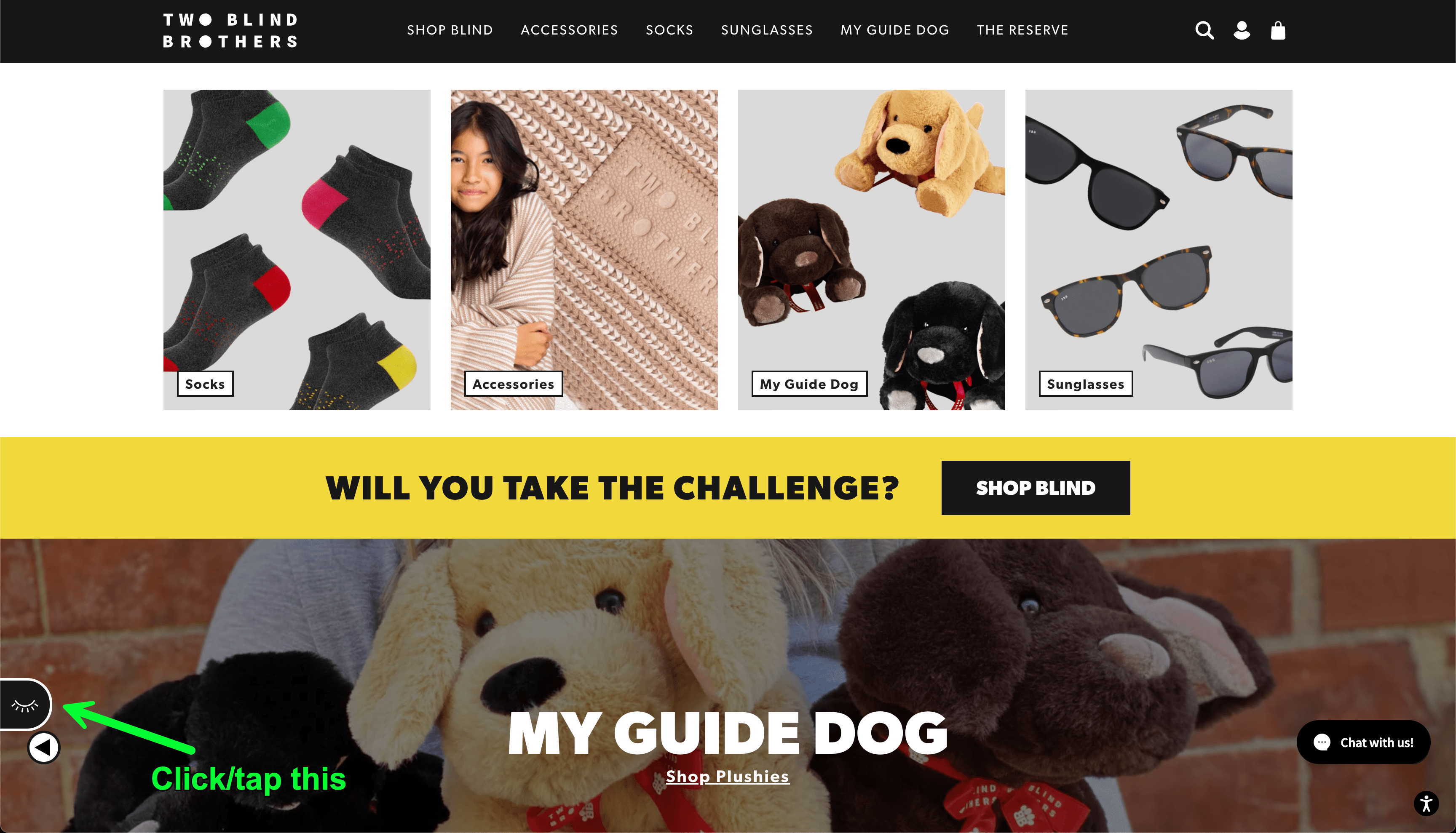
One example that always comes to mind is the Two Blind Brothers website. If you go to the website and click/tap (this works on mobile), the closed eye in the bottom left corner, you will see the eye open and a simulation begins. Both the brothers, Bradford and Bryan Manning, were diagnosed at a young age with Stargardt’s Disease. Stargardt’s disease is a form of macular degeneration of the eye. Over time both brothers will be completely blind. Visit the site and click the eye to see how they see.
If you were in their shoes and you had to navigate through a page, you would want to make sure you knew exactly where you were throughout the whole experience. A focus ring gives you that power.

Demo
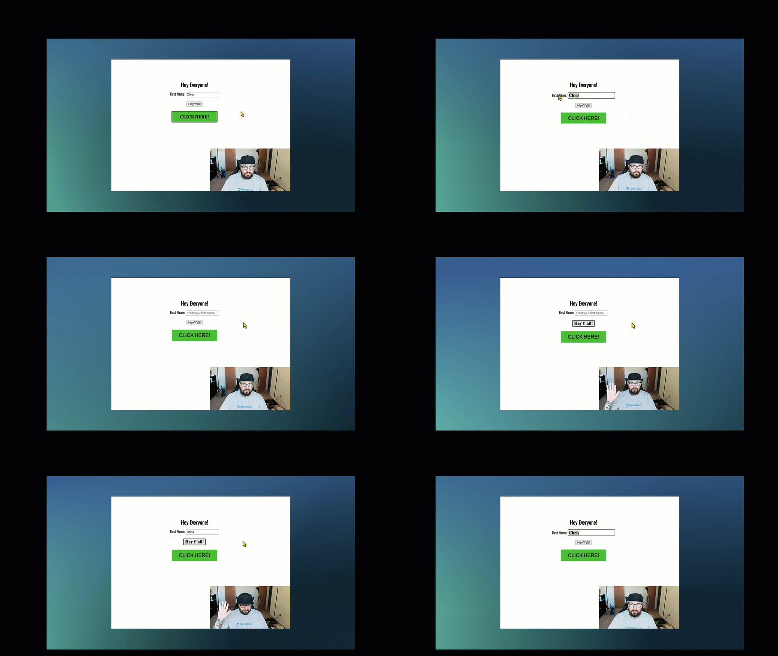
The demo below shows how :focus-visible works when added to your CSS. The first part of the video shows the experience when navigating through with a mouse the second shows navigating through with just my keyboard. I recorded myself as well to show that I did switch from using my mouse, to my keyboard.

The browser is predicting what to do with the focus ring based on my input (keyboard/mouse), and then adding a focus ring to those elements. In this case, when I am navigating through this example with the keyboard, everything receives focus. When using the mouse, only the input gets focus and the buttons don’t. If you remove :focus-visible, the browser will apply the default focus ring.
The code below is applying :focus-visible to the focusable elements.
:focus-visible {
  outline-color: black;
  font-size: 1.2em;
  font-family: serif;
  font-weight: bold;
}
If you want to specify the label or the button to receive :focus-visible just prepend the class with input or button respectively.
button:focus-visible {
  outline-color: black;
  font-size: 1.2em;
  font-family: serif;
  font-weight: bold;
}

/*** OR ***/

input:focus-visible {
  outline-color: black;
  font-size: 1.2em;
  font-family: serif;
  font-weight: bold;
}
Support
If the browser does not support :focus-visible you can have a fall back in place to handle the interaction. The code below is from the MDN Playground. You can use the @supports at-rule or “feature query” to check support. One thing to keep in mind, the rule should be placed at the top of the code or nested inside another group at-rule.
<button class="button with-fallback" type="button">Button with fallback</button>
<button class="button without-fallback" type="button">Button without fallback</button>
.button {
margin: 10px;
border: 2px solid darkgray;
border-radius: 4px;
}
.button:focus-visible {
/* Draw the focus when :focus-visible is supported */
outline: 3px solid deepskyblue;
outline-offset: 3px;
}
@supports not selector(:focus-visible) {
.button.with-fallback:focus {
/* Fallback for browsers without :focus-visible support */
outline: 3px solid deepskyblue;
outline-offset: 3px;
}
}Further Accessibility Concerns
Accessibility concerns to keep in mind when building out your experience:
- Make sure the colors you choose for your focus indicator, if at all, are still accessible according to the information documented in the WCAG 2.2 Non-text Contrast (Level AA)
- Cognitive overload can cause a user distress. Make sure to keep styles on varying interactive elements consistent
Browser Support
This browser support data is from Caniuse, which has more detail. A number indicates that browser supports the feature at that version and up.
Desktop
| Chrome | Firefox | IE | Edge | Safari |
|---|---|---|---|---|
| 86 | 4* | No | 86 | 15.4 |
Mobile / Tablet
| Android Chrome | Android Firefox | Android | iOS Safari |
|---|---|---|---|
| 123 | 124 | 123 | 15.4 |
Links
- https://daverupert.com/2024/01/focus-visible-love/
- https://css-tricks.com/almanac/selectors/f/focus-visible/
Managing User Focus with :focus-visible originally published on CSS-Tricks, which is part of the DigitalOcean family. You should get the newsletter.
- 0 Comment
